Dog Tired


Image

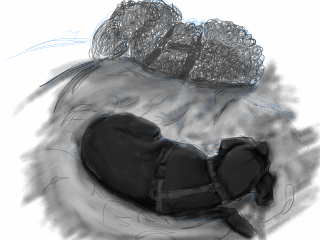
I have to be honest and say that my current process of staying up late and not going to sleep until the wee hours of the morning is catching up. My daily art and studies aren’t getting the attention they deserve and something needs to change. That said, I present you with today’s piece, our two dogs, Peppie and Jack. Peppie is the fuzzy little poodle in the back, and Jack is the rat terrier in the front. They are around 12 or 13 years old and enjoy their naps but still have a lot of energy in general. I was able to catch them napping, and grabbed my iPad to do some form sketching. I ended up shading them instead.

The important thing to note here was my mindset. I was very careful to consider the fact that their harnesses are red and try to figure out how to convey that through grey tones. I was also mindful of the lighting in the room and the space they both shared and the negative space around them. I rendered Peppie with only circular strokes while I rendered Jack with only straight or angled strokes. This is very contrary to how I would have approached drawing them in the past and that means I’m on the right track. 
 

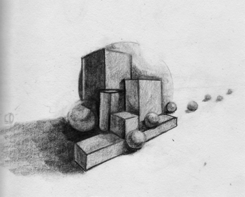
Going the Distance

ImageGraphite: 2H, HB, 2B

This exercise was all about the distance between or around the objects in the scene. I made it up to test my ability to discern how to shade these relationships in forms. In general, I am starting to understand and think about lighting a lot more as I shade. I don’t feel entirely confident that I nailed the lighting, but I am enjoying my continued practice and efforts with graphite. 

All in all, I like that I’m getting darker tones much easier and more naturally. Also, in this pic the small light symbol on the right is the secondary light. There is a larger source above to the left, pointing down at an angle. 


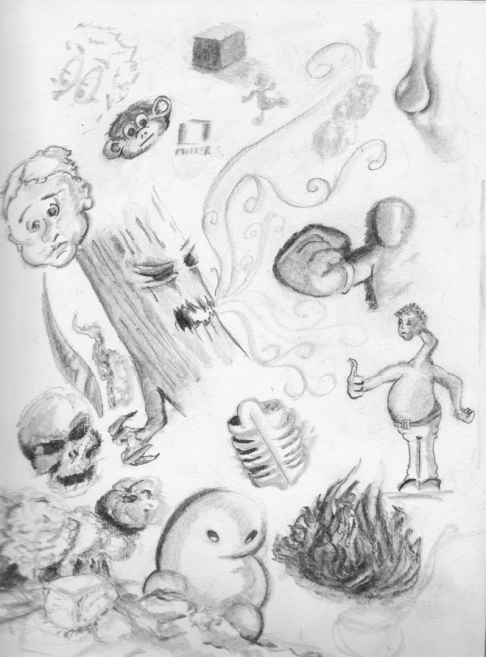
Doodle all the Day

Image

Doodle: Graphite 2H, HB, 2B Blending stump

A thought occurred to me earlier as I was having a discussion with my cousin about art and the amount of artists we know with talent who loathe art because they’ve lost touch with what was fun about art in the first place. The thought that struck me was this, I had the most fun in life when I could sit in class and doodle and be carefree. I remember some of those days very keenly and I always remember slinking back in my chair and tuning the teacher out and creating some random scene or bits of scenes on the sides of my exam or some other papers. I thought for today instead of an intense study, that I would simple allow myself to doodle and see what came out. I only had one rule for myself and that’s since I’m practice values and form that I had to lay down a block of value and then see what I could make with it. Everything else didn’t matter. correct lighting, perspective, composition, anatomy… all got chucked out the window. Just me and my imagination and some fairly odd music. Anyway, below are my results.

Take a day, give yourself permission and just doodle or smear paint about on a canvas. Have a bloody good time without any rules about your art. Share it below. I’m dying to see what you come up with.

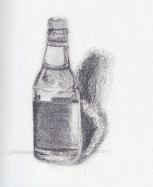
Message in a Bottle

Image

Graphite: 2H, HB, 2B, Kneaded Eraser (no linework, value rendering only)


Every time I think I’m getting a good handle on the basics, I stumble across a concept or process I’ve not heard of. This is a value drawing. There is only one rule: No Lines. Of course, through the use of tight shading you can make it look like there are some lines, but that’s really the point… lines are value! every time you start an illustration with lines, you are already laying down some base value without realizing it (or perhaps you do). This is just a bottle I had sitting on my  desk. It had some cold foil around the neck wrapper which I found  difficult to really capture the values of the shiny vs non-shiny areas. Also the bottle was sitting in front of a white piece of paper that was curling around it somewhat. So if the shadow seems funky, that’s the most likely culprit. 

Well the “Message in a Bottle” title for this post came from my wife since she named the file after scanning it in for me, but honestly I did get a message from this. I realized that I don’t need to be so rigid and draw with line to start with and that it can be really rewarding to block out areas of value and see the forms get sculpted from build up of tone or erasing for highlights. 

Do you draw with value or do you draw with line. Which do you feel works better in your experience?


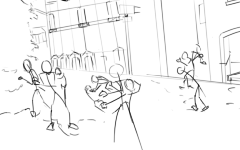
Get a Move On!

Image


Digital : Photoshop, Wacom Tablet

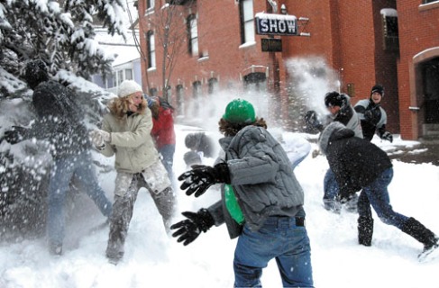
I’ve been spending some time studying a cartooning book and looking into starting scenes with action lines. This concept has always seemed slightly foreign to me because it is really difficult for me to remove mass from something and then come back in and add it to build it up. This exercise was to take a photo and dissect it to see the action lines at work and see how the composition comes into play. In honor of the massive snow belts that have been hitting our area and the fact that I just entirely wrecked my wife in a snowball fight, I chose the picture below. This is actually a really neat scene that I studied as there is so much simultaneous action. However, I’m not entirely sure that as a silhouette this is viable. Also, I feel like my action lines are too rigid. Do you draw with action lines or do you go straight to mass and volume? Share your thoughts below. 

Image


42

Image

Graphite: HB, 2B, Non-Photo Blue, and 2H

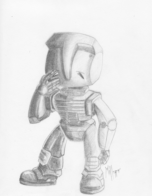
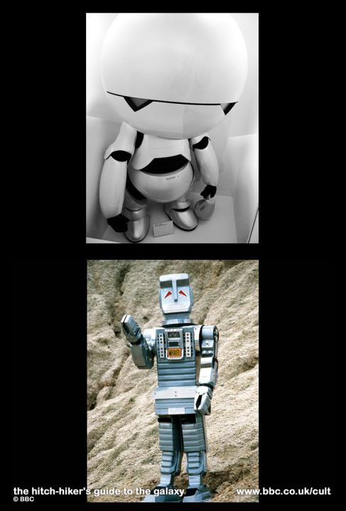
Today marks my 42nd day of art and blog posts in a row for me. It’s not really a number one would think to benchmark, but 42 is the answer to the ultimate question of life, the universe, and everything, and thus worthy of a benchmark art piece. If you’re not familiar with The Hitchhiker’s Guide to the Galaxy, I suggest you go and look it up and get to watching. Now, to that end, in the great cinematic history of H2G2 there are 2 variants of “Marvin the Paranoid Android” a character who’s quite depressed and at the same time a very fun character to imagine. 

Below, there are 2 visual variants that exist to date of “Marvin the Paranoid Android”. I submit my version above as a neat combination of the two in a perhaps shallow attempt to not copy either of the two visual styles and create my own character version. Further, it was a great way to practice building with forms and see what I could make. What do you guys think?

Critiques and Comments are always welcome. 

ImageAll images are copyright their respective owners, I merely used the images above as reference whilst imagining my own version of the character. No infringement is intended. 


Scumbling Around in the Darkness

ImageGraphite: Mostly HB added 2B on some at the bottom

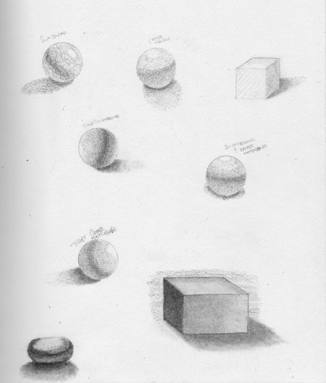
Scumbling is an actual term used for shading. I’d never heard of it until today. It is essentially using continual figure 8’s to feel out the shape of a form. Well I decided to give it a go and see what kinds of shading I could come up with. It was a very busy day for me and I only had about 3 hours total to divvy up between my research and practice. I opted to spend most of my time researching and learning about how to create more convincing forms. Scumbling was one of the techniques discussed, as was hatching and cross hatching. Soon after hatching my first sphere I realized I had no clue where to actually start with hatching and how to effectively build it up as I went. These are my attempts from today to understand hatching and scumbling. The other two at the bottom are from a process that was referred to as rendering where you lay tone down and then “sculpt the form” by erasing and adding graphite as necessary.

 I found this article very interesting and took a lot of what they have to say to heart. I will be thinking around form as much as I can moving forward.

http://www.animatorisland.com/tips-for-drawing-form-and-volume/

City of Forms

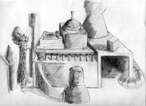
ImageThis is a form rendering using HB, 2B, 4B and was initially sketched out using non-photo blue. 

I am still working my way through practicing with forms. Today, I took stuff from all over the house and created a setup lit by an overhead light and a Floor lamp as a secondary light. I noticed that my composition of forms resembled some sort of city and thought I’d play that up. Since I’m only supposed to be doing form drawings and studies for the moment, I kept most of the forms in their native state, but I couldn’t help changing up some of the stuff to aide the city feel. 


What Do I Want To Draw Today (WDIWTDT)

Image ImageImageImage

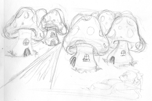
I think I might be coining this acronym for myself. It was pretty awesome today. After 38 Days (today makes 39) straight in a row of doing art and art study, I woke up and asked myself the question: What do I want to Draw Today? It was an important realization that I have that kind of freedom to ask that question. While I may not yet be perfect at drawing what I want to draw, I have the opportunity to decide what I do want to draw and how I will approach it. 

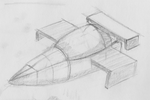
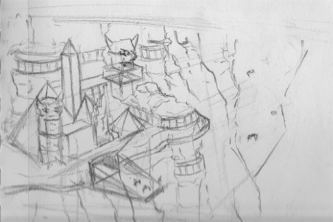
Anyway, WDIWTDT (pronounced WiddyWidt) got turned into an exercise. I sat down and thought up things that I wanted to draw in one form or another and then executed sketches aimed at satisfying the answers. The things I thought of were:

  1. A Sci-fy / Fantasy mushroom village
  2. Space Ship (ultra futuristic) 
  3. Civilization on the side of a cliffwall (pseudo- Egyptian ~ futuristic
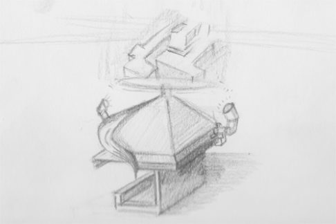
  4. Futuristic Gadget Concept

I then grabbed my sketchbook and began thinking what each of these would look like but I did something I’ve never done before. I thought first about form and perspective on each one. It was a pretty cool feeling. While these may not be the best ideas or sketches, the importance here was my thought process. I can draw whatever I want to draw, if I think in terms of form and perspective and consider light and shadow. All of these sketches were done without the aid of any rulers or straight edges. I worked quickly to get the concepts out and didn’t worry much about shading or detail. I believe I will flesh out each of these pieces at some point but for now. I’m just excited to be drawing free and from my mind. 

P.S. The gadget concept is some  sort of thermal imager. Heat lamps strike a clear disc as it spins and the charged ions lift upward to create the images. 


Apples to Apples

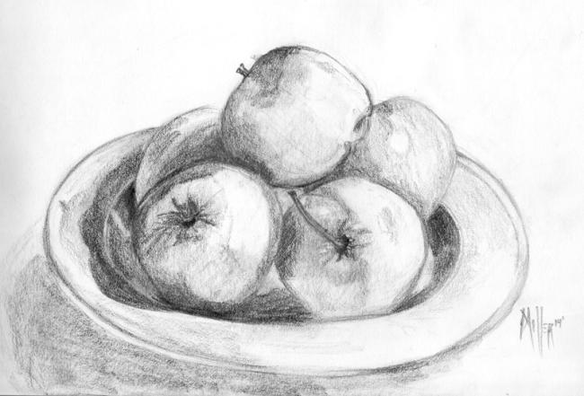
ImageGraphite: (HB, 2B, 4B)

So today I was just continuing my study in book 2 of The Complete Famous Artist Course. In preparation of the first assignment it says to sit down and gather basic items and practice drawing only in form and to negate most of the details. So I grabbed a bowl / plate and some apples and sat down and started drawing them while keeping only form in mind. It was hard not to stray and start putting in details I really wanted to do the little spots and all the things that are so obvious to apples. However, I fought through the urges and stayed true to the task at hand. I know it’s not much at the moment, but I’m sure as I practice, more interesting art will be produced that more closely resembles the point of this blog which is Fantasy Art and Concept Art. 

What do you guys think of my progression thus far? Any hints or advice? Should I keep going with The Complete Famous Artist Course or should I look into other books and topics? Share your thoughts below.